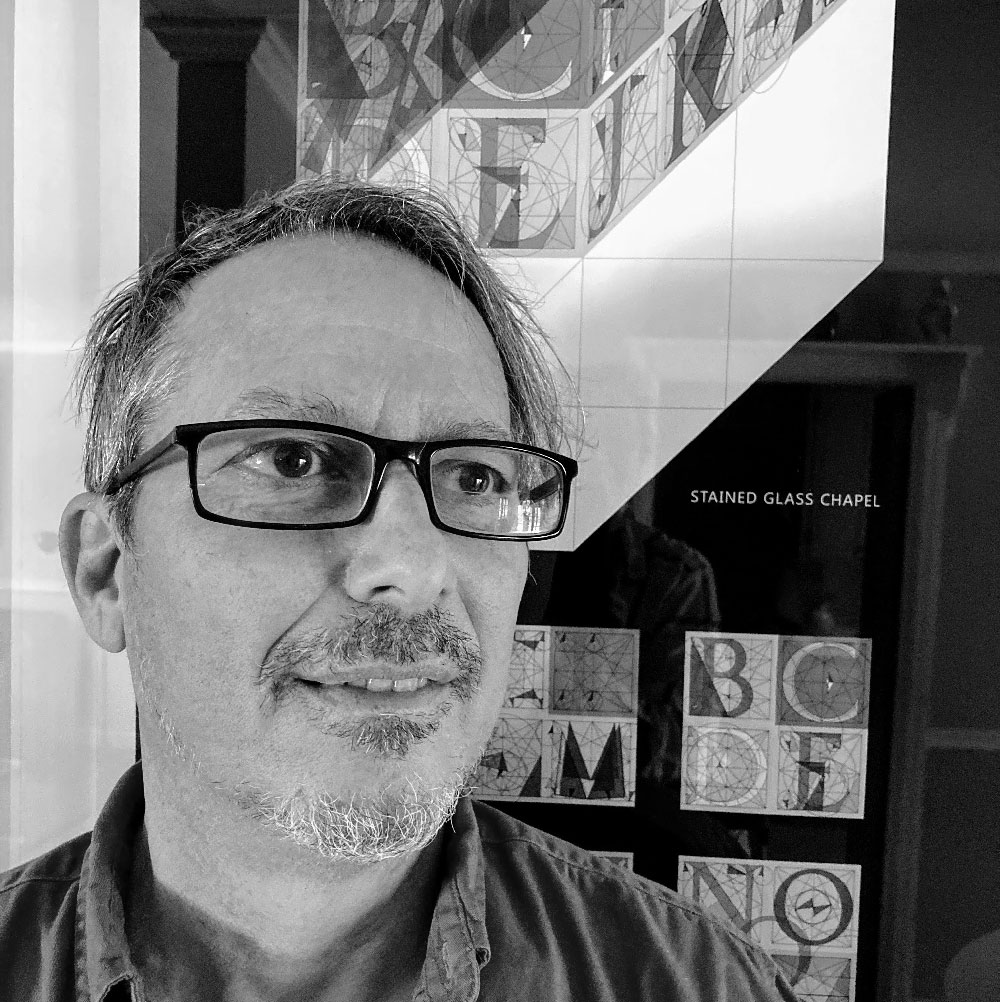
ABOUT
STEVEN
“We do not ask for what purpose the birds do sing, for song is their pleasure since they were created for singing. Similarly, we ought not ask why the human mind troubles to fathom the secrets of the heavens. . .”
–Johannes Kepler
The Renaissance investigation of letterform was first brought to my attention while I was in grade school. I was intrigued by the logo ‘M’ of the Metropolitan Museum of Art. The letter was originally drawn collaboratively by the renowned Renaissance figures of Fra Luca Pacioli and Leonardo Da Vinci. I’ve been a student, and then a professional, of graphic design ever since.
I loved my eighth grade drafting class, taught by my favorite teacher, Louis Horvath, at Hammarskjold Middle School in East Brunswick, New Jersey. In his class I became fascinated with the T-square and triangle, bowled over by tricks to draw extremely accurately without measure or mathematics.
As a young man I found true intimacy when drawing. With straightedge and compass, rolling the lead as my pencil flowed along its guide, my physiology would change. I would like to think of those noticeable changes in my physical body as bliss. When I read Edwin Abbott’s famous story Flatland I was smitten by his world. Abbott created a fantasy of a two-dimensional geometric society where one member, Square, struggled to realize his encounters with three-dimensional form.
My project technically began in 1983 while studying Graphic Design, at Tyler School of Art, in Rome. My professor Mario Lovergine gave me an assignment to design a logo for the city. I focused my attention on the initialism SPQR which is used as an official emblem of modern-day Rome. It represents a Latin phrase; Senatus Populusque Romanus (The Roman Senate and People). I wanted to use these initials in my design while exposing a studied understanding of each letter’s geometry.
I approached the assignment to design a logo for the city by first acquiring a Xerox copy of the Roman Alphabet to study. There was no earth shattering concept of proof that I was planning. I just wanted to design a logo to represent the classicism of Rome. I went about my project the old fashion way. I had a T-square, triangle and compass. We didn’t have computers in the graphics field yet. I used many layers of tracing paper, shifting and rotating various shapes to help me draw the letters solely based on geometry. My compass poked holes in the tracings as I searched for center points. I had lots of tracings and lots of holes. Somewhere along the line I noticed that these holes were producing a triangular pattern. I was able to use this pattern to reveal a design paradigm that is responsible for all the curvy letters of the alphabet. I also found that this same triangular pattern formed all the angular shapes of the alphabet. I did not yet understand the mathematical phenomena contained within this simple triangle.
Michelangelo imagined his sculptures existed within blocks of Carrera marble. He just needed to chip away at the stone to find them. I feel that same sense of a preexistent form about the Roman alphabet. The letters already existed in space in some existential form and it was my job to chip away at their shapes to find their geometric origin. It’s my understanding that mathematicians have the same feeling of discovering or uncovering formulas that already exist.
I so wish I could sit with Tory, Dürer, Da Vinci, Pacioli, Kepler, Galileo and the others to discuss my findings. I hope my work is considered a continuance of theirs.