Sacred Geometry and the Roman Alphabet
Sacred Geometry is an ancient field of physics whose equations are expressed through shape. Shape is a way to explore the universal fabric of our existence. Certain patterns dictate the world which surrounds us. Proportion is the prime factor considered in these patterns. Shapes, such as the Platonic Solids, express these proportions within their geometry. The properties of these shapes are thought to express energies. To me, these energies are the God particle. Sacred Geometry is the study of the spiritual paradigm on which God’s garden grows. Sacred Geometry is the art in heaven.
The definition of an alphabet is very specific. It is a form of written communication whose symbols are abstractions that represent specific vocal sounds. The letters group to form sounds. The sounds form into words. An alphabet is different from other forms of writing because its symbols are not a pictorial-based system such as hieroglyphics.
Historically it is established that the alphabet was created by the Phoenicians between 1700 and 1500 BCE in the Sinai. ALL alphabets including the Hebrew and Latin alphabets germinated from this one parent. The history of how the shapes of Roman letters came to be is well documented. The alphabet slowly adapted from the Phoenician letterform into our modern letters through interactions of commerce and war.
The back story gets more complex and perhaps can only be decoded through speculation.
Art in Heaven
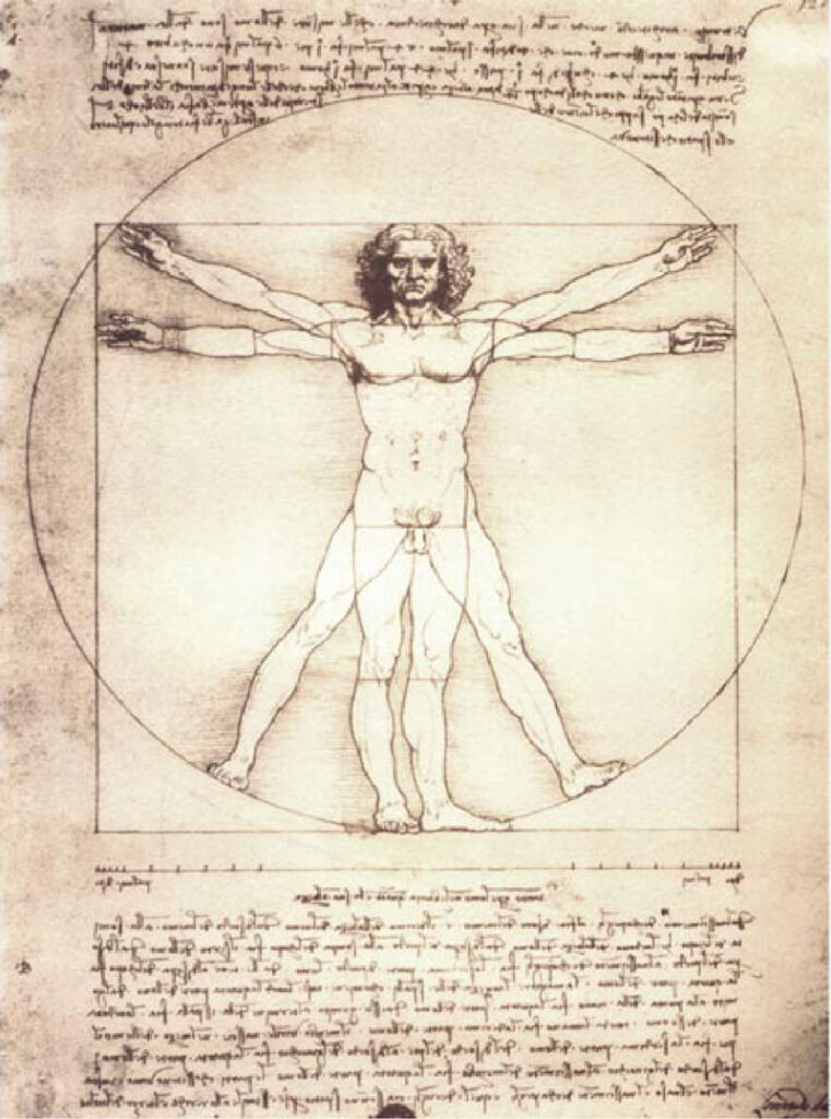
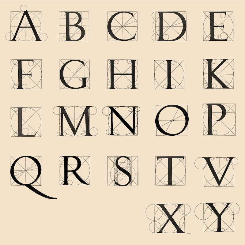
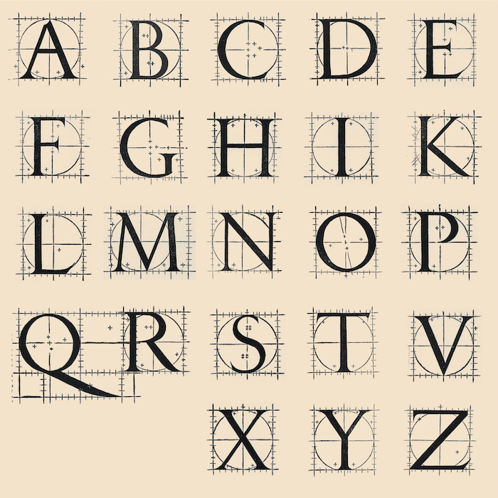
Luca Pacioli and Leonardo da Vinci presented their manuscript, Divina Proportione, in 1498 to the Duke of Milan, Ludovico II Sforza . It is about mathematical proportions, mysticism and geometric systems. In 1509, the first printed edition of Divina Proportione was published in Venice. Within this publication Pacioli first included a geometric construction of the Roman alphabet. Twenty three pages of the book are dedicated to this topic. One page per letter.
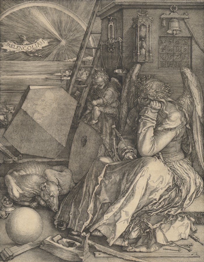
There doesn’t seem to be a consensus amongst scholars that Leonardo da Vinci designed and drew this alphabet, however, Jerzy Kulski, in his book Leonardo da Vinci and the Pacioli Code, © 2019, makes a compelling argument matching these published letters to letterforms found in Da Vinci’s paintings. Other known constructed alphabets from this period were by Felice Feliciano, Damian da Moyle, Albrecht Dürer, Geofroy Tory, Sabastian Serlio, and an unattributed author of an alphabet whose work is known as The Newberry Letters. With these efforts no one succeeded in developing an actual proportional system for the alphabet, a point that highly valued academics have clearly made. Consensus among academics wrongly believe the constructed alphabets from the Renaissance were simply a task to insure that good looking lettering would be available to adorn architecture.
As noted, many Renaissance artists created geometric drawings of the Roman alphabet. It is clear in Tory’s work that his explorations attempted to resolve an ancient Kabbalistic alphabet based creationist story known as The Sefer Yetzirah. Interest to reconcile early Christianity with its Jewish roots drove this esoteric exploration. The Renaissance concept considered that the Roman alphabet shared the same ‘divine’ mysteries as the Hebrew letters.
This humanist endeavor, to investigate ancient Jewish mysticism, was led by Giovanni Pico della Mirandola. Pico was a nobleman intellectual who was connected to the prominent families of Italy; the Sforza’s of Milan, the Medici’s of Florence, and the Estes of Ferrara. Pico collaborated with the German humanist scholar Johann Reuchlin who was accomplished at translating Hebrew. To defend their actions from accusations of heresy they argued that there was strong support of Catholic doctrine within the antique pre-Christian Jewish literature.
Pico’s argument did not sway the church. He was charged with heresy but released with impunity when Lorenzo de Medici came to his aid. However, suspiciously, Pico died young at the age of 31. He was thought to have been murdered. Pico is considered the father of the Christian Kabbalah. His influences impacted the courts of Florence and Ferrara as well as the French royal court in Paris.
Henry Cornelius Agrippa held lectures at the University of Dole on the work of Pico and Reuchlin. Agrippa faced growing hostility from Catholic orthodoxy at a time when anti Jewish sentiment was reaching a crisis with The Burning of the Vanities where Jewish books were being gathered up and destroyed. That same year Agrippa began drafts for his work Three Books of Occult Philosophy. Excerpts from this book clearly speak to his knowledge of The Sefer Yetzirah and its alphabet based creationist story. I have not yet found the reasons for his statement that all alphabets (not just the Hebrew alphabet) were designed by God. However, the divinity of the Roman alphabet was a definite humanist interest.
The omnipotent God hath made by his providence divided the speech of men into divers languages; which languages have according to their diversity received divers, and proper characters of writing, consisting in their certain order, number, and figure, not so disposed, and formed by hap, or chance, nor by the weak judgment of man, but from above, whereby they agree with the celestial, and divine bodies, and virtues. . . .
The position of the stars being first made in the seat of God, which is heaven, after the figure of them are most fully formed letters of the celestial mysteries, as by their figure, form, and signification.
–Henry Cornelius Agrippa,
Three Books of Occult Philosophy, Chapter LXXIV p.223
A century later Galileo displays his esoteric knowledge, by hiding in plain site, a detailed description of The Sefer Yetzirah.
[The universe] cannot be read until we have learnt the language and become familiar with the characters in which it is written. It is written in the mathematical language, and the letters are triangles, circles and other geometrical figures, without which it is humanly impossible to comprehend a single word.
–Galileo, Opere Il Saggiatore, p. 171
Logically there was motivation to examine the Roman letters and unlock their divine geometric puzzle. However all attempts by Renaissance artists to draw such a theological alphabet failed. Brutal trials of heresy had to influence the presentation of these alphabets. The exploration of letterform, for the most part, was covertly categorized as instructional templates for the trades to properly draw letters for architectural adornment.
The ancient story, The Sepher Yetzirah, the Book of Creation, is one of the oldest Jewish texts with a manuscript dating from circa the fourth century AD. Its story is also found in the Zohar, a written account of the oral traditions of the Kabbalah. As with many sacred texts, it has been studied and interpreted by great scholars. I will give you my simplistic understanding of the text along with some rather peculiar observations.
God created the universe by filling the void with the letters of the alphabet and from this alphabet he created all that was ever to be.
Twenty two foundation letters: He engraved them, He carved them, He permuted them, He weighed them, He transformed them, And with them, He depicted all that was formed and all that would be formed.
–The Sefer Yetzirah, The Book of Creation,
original manuscript circa the 4th century AD, Aryeh Kaplan,
Weisers Books, 1997, San Francisco, p.100
Rabbi Aryeh Kaplan explains: with each act of creation, the Torah reports that ‘God said.’ Thus ‘God said: let there be light,’ and ‘God said, let there be a firmament.’ The decrees through which God brought creation into being consisted of sayings. These in turn consisted of words, and these words were formed out of letters. Hence, it was through the letters of the alphabet that the universe was created.
In the following verses from Genesis we get a glimpse of the Judeo/Christian creationist story and its similarity to the story of The Sefer Yetzirah.
In the beginning was the word, and the word was with God, and the word was God.
–King James Bible, John 1:1
Forever, O God, Your words stand in the heavens.
–Psalms 119:89
Some credit Moses with bringing us the alphabet. According to the bible the alphabet was first engraved by God onto the tablets of the Ten Commandments and given to Moses on Mount Sinai.
The commandment; Thou shalt not make unto thee any graven image, or likeness of anything that is in heaven above, or that is in the earth beneath, or that is in the water under the earth, is of particular interest to me. Although this commandment is meant to forbid idol worship it also serves as the very definition of an alphabet. An alphabet is a standardized set of abstract symbols called letters that represent the sounds of a spoken language. These letter symbols are abstract shapes not meant to represent or define any given idea through its form. A letter shall not be the likeness of anything that is in heaven above, or that is in the earth beneath.
The reason that I find this passage interesting is that it is the one necessary element that allows the alphabet creationist story to make sense. The twenty two letters of God’s creation could not be the spark of genesis if the letterforms were at all representational. How could a hieroglyph, let’s say of a cow, come before the existence of a cow? Therefore the abstraction of the alphabet is necessary to the story of The Sefer Yetzirah. Theological details, whether my reasoning is correct or not, were certainly important to the Renaissance humanists as they explored the shape of letters.
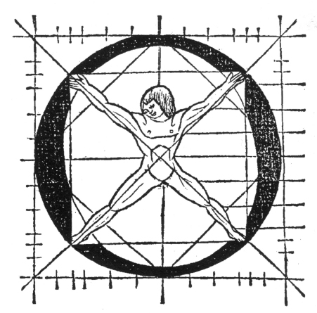
I can only imagine the importance the alphabet held to men like Tory, Dürer, Da Vinci, Pacioli, Galileo and the others who sought to understand the influences of the antique on Catholicism. I wish I could discuss with them this phenomenal alphabet. I would demonstrate to them my discovery in which every nuance of every letter is based on the divine proportion. This paradoxical alphabet, now finally resolved, is truly art in heaven.
My contribution to their work at this time is the discovery that a systematized Roman alphabet constructed from the Golden Ratio does exist. The rest of this article is technical and focuses in on the drawing of the letter O. As you will see, every aspect of the letter O is spun from the Golden ratio. All 26 letters of our modern alphabet is based on this ratio in ways so simple yet so creative it boggles my mind.